Website, business card, signage, social media profiles… the logo is the first thing a client sees about us.
Precisely, when we talk about a logo, we refer to a figure that usually represents a product, a service, a company, an organization, a musical group, or something else; typically, it consists of a symbol or a brand or a graphical representation of a name or an acronym that involves the use of very specific lettering. [Wikipedia] [Wikipedia]
As with everything else, we can encounter successful projects capable of entering and remaining in the collective imagination, and others that quickly fade into oblivion.
Here are 5 logos that have managed to capture attention throughout history and remain in the public’s mind.
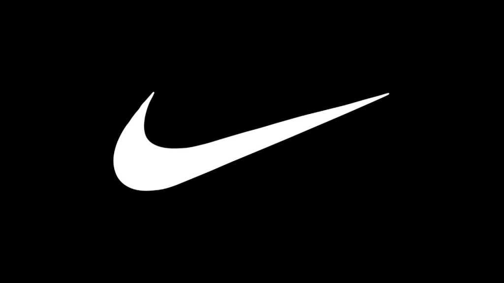
NIKE – SWOOSH
And what if we told you that the famous Nike Swoosh! didn’t originate in a graphic studio or creative agency. Il budget investito, non è nemmeno lontanamente paragonabile a quelli stellari di cui sentiamo parlare oggi.
It was Carolyn Davidson, a design student, who created the famous swoosh for just $35!
APPLE
Created by Rob Janoff in 1977 as a personal favor to his friend Regis McKenna, his employer and Steve Jobs’ friend. Many think it’s a tribute to Isaac Newton when, in reality, it seems that the inspiration for this logo came back from grocery shopping, placing a bag of apples on the kitchen table.

Credits: www.apple.com/ac/structured-data/images/open_graph_logo.png?201703170823
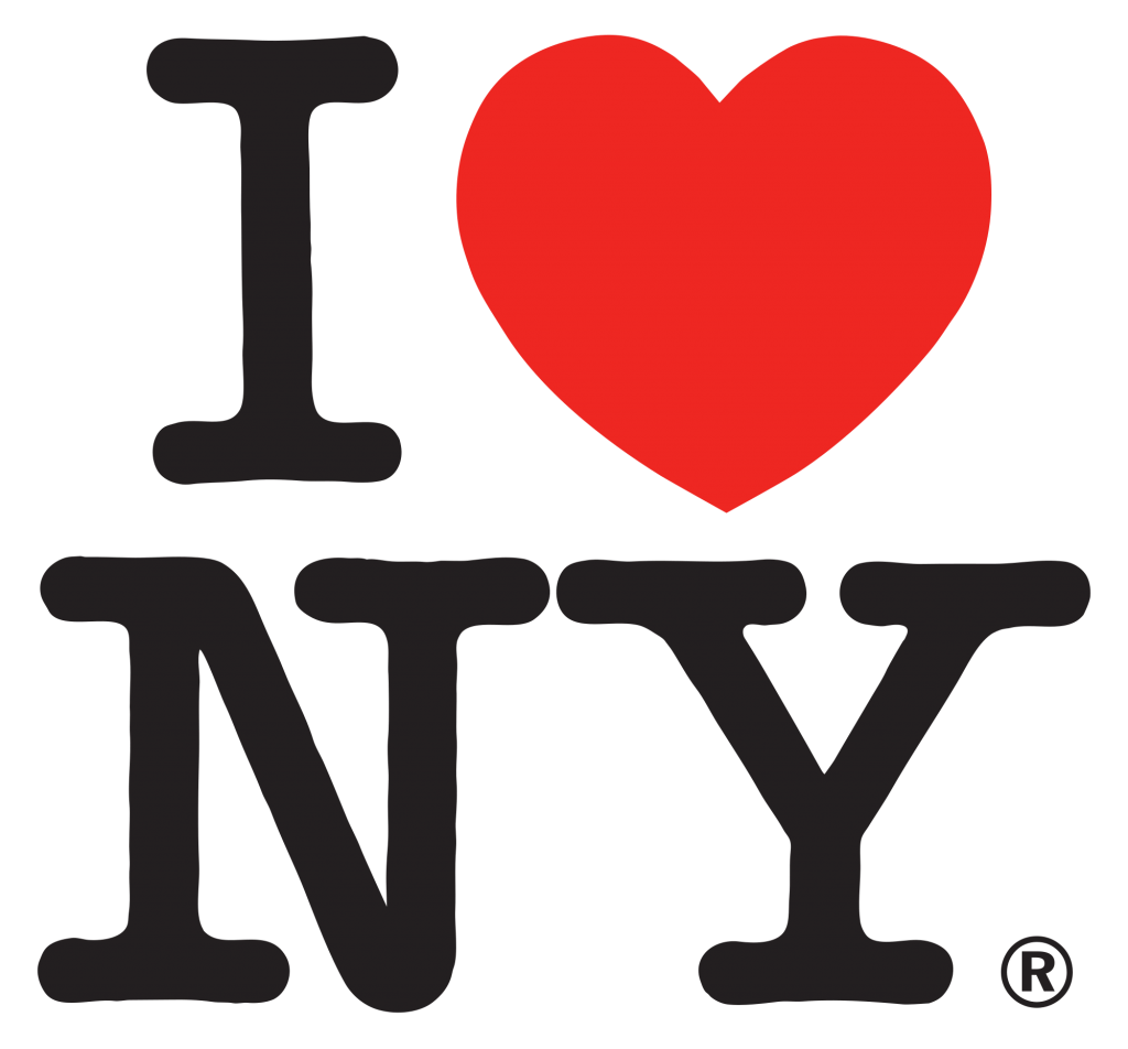
I LOVE NEW YORK
Logo designed by Milton Glaser (designer and artist ), in 1976. The aim of the logo is to promote tourism in the Big Apple. In its simplicity, the logo quickly enters the collective imagination, especially thanks to its widespread use on prints and gadgets. The logo is composed of a simple writing made with the American Typewriter font and the stylization of a heart as a replacement for the word Love.
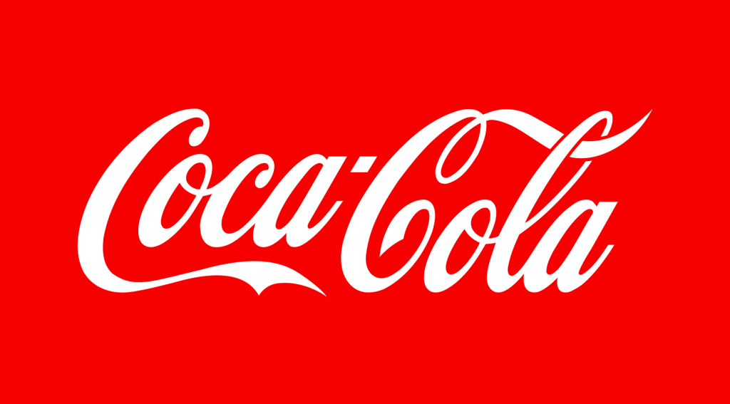
COCA COLA
One of the most recognizable logos in history. Was it made by a designer? An artist? A graphic designer?
No! The company accountant, Frank Mason Robinson, was the one who created it. He made only slight modifications to the original lettering, which was based on the Spencerian Script font.
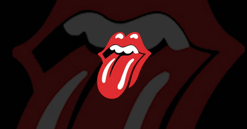
THE ROLLING STONES
An iconic and revolutionary symbol that has marked the history of rock.
Created by twenty-four-year-old John Pasche, a student at the Royal College of Art, involved by Mick Jagger himself.
Credits:img.wennermedia.com/social/rs-200878-rolling-stones-logo-wallpaper-1024×640.jpg
Would you like to delve into the topics discussed in the article and start building your own brand identity? Contact us to discuss it together!


